ResizeObserver: The Complete Guide to Watching Element Size in JavaScript and React
You build a dashboard card that shows a chart. On a wide screen it looks great. Then a user collapses the sidebar, and the chart stays the same width, spilling out of its container. You reach for the window resize event, and it does nothing, because the browser window never changed size. Only the card did.
This is the exact gap that ResizeObserver fills. It is a browser API that tells you when an individual element changes size, no matter what caused the change: a sidebar toggle, new content, a font loading late, a CSS class swap, or a user dragging a resize handle.
This guide explains how ResizeObserver works, what it reports, when it fires, and how to use it safely in plain JavaScript and in React. We cover the options most tutorials skip, the infamous "loop completed with undelivered notifications" error, performance, testing, and the situations where CSS alone is the better answer.
What Is ResizeObserver?
ResizeObserver is a web platform API that reports changes to the size of DOM elements. You give it a callback and one or more elements to watch. The browser calls your callback whenever an observed element's size changes.
According to MDN's documentation, it can report changes to the content box or border box of an element, or the bounding box of an SVG element. It is marked as and has been available across major browsers since July 2020, so you can use it in production without a polyfill for most audiences. The formal definition lives in the from the CSS Working Group.
Use a hidden <iframe> or <object> trick to get a resize event inside an element. This is fragile and heavy.
Call getBoundingClientRect() after every change you cause. This only works for changes you know about.
Reading layout properties such as offsetWidth can also force the browser to recalculate layout immediately, a problem known as forced synchronous layout (also called layout thrashing when repeated). web.dev explains it in Avoid large, complex layouts and layout thrashing. Done repeatedly, it causes jank. ResizeObserver avoids the problem because the browser notifies you after it has already computed the layout.
The Basic API
There are three parts: the constructor, the methods, and the entry objects passed to your callback.
const card = document.querySelector(".card");

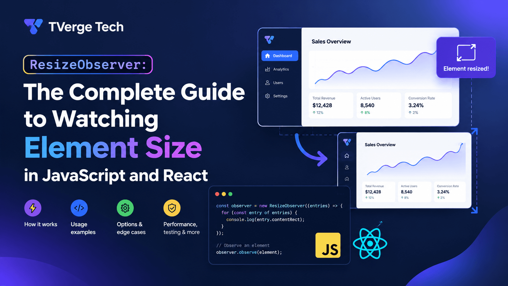
const observer = new ResizeObserver((entries) => {
  for (const entry of entries) {
    const { inlineSize, blockSize } = entry.contentBoxSize[0];
    console.log(`Content box: ${inlineSize} x ${blockSize}`);
  }
});

observer.observe(card);
The ResizeObserver() constructor takes your callback. That callback receives two arguments: an array of ResizeObserverEntry objects, one for each observed element that changed, and a reference to the observer itself.
Prefer the *BoxSize properties in new code. They return ResizeObserverSize objects that use logical dimensions (inlineSize and blockSize), which map to width and height in horizontal writing modes and swap for vertical ones. Each is an array because the spec allows for fragmented elements, such as content split across multi-column layouts. In everyday use, read index 0.
Choosing the Box: Content, Border, or Device Pixels
By default, ResizeObserver watches the content box. That detail surprises many developers. If you add padding or a border to an element, its visible size changes but its content box may not, so your callback may never fire. MDN's guide to the CSS box model is a good refresher on how these boxes relate.
You can choose what to watch with the box option:
observer.observe(card, { box: "border-box" });
The three accepted values are:
"content-box" (default): the area inside padding.
"border-box": includes padding and border. Use this when you care about the element's full footprint.
"device-pixel-content-box": the content box in physical pixels. Useful for crisp canvas rendering.
The observe() method reference on MDN documents these options and their browser support. Check the compatibility table before relying on device-pixel-content-box, because it is not available everywhere.
A related detail from the web.dev guide: the observer reports both content dimensions and padding through contentRect, but it only watches the content rectangle. Do not confuse contentRect with the element's bounding box.
When Does the Callback Fire?
Understanding timing prevents a lot of confusion.
It fires after layout and before paint. Per the Resize Observer specification, observations are gathered and delivered as part of the browser's rendering steps, once layout has been computed. This means you can read offsetWidth, scrollWidth or clientWidth inside the callback without triggering an extra forced layout, and any changes you make can still be reflected in the same frame, before the user sees anything.
It fires once when you start observing. When you call observe(), the browser compares the element's current size to a last-reported size of zero. If the element has a real size, you get an initial callback. If the element is display: none, its size is zero and there is nothing to report until it becomes visible.
It does not fire for every kind of change:
CSS transforms such as scale() do not change layout size, so they do not trigger the observer.
Non-replaced inline elements (a plain <span> with display: inline) have no box size in the sense the API uses, so they are not reported.
Changes to position alone, with no size change, are ignored.
If you need position or visibility changes, you want a different tool, such as the Intersection Observer API or scroll listeners.
Practical Use Cases
1. Resizing a canvas or chart to its container
A <canvas> element has an internal pixel buffer that is separate from its CSS size. If the two drift apart, drawings look blurry or stretched. ResizeObserver keeps them in sync, and devicePixelRatio helps on high-density screens:
Notice the guard that only touches canvas.width when the value changed. Assigning to those properties clears the canvas, so avoid doing it needlessly.
2. Detecting truncated text
You want to show a "Read more" button only when text is clamped. Because the callback runs after layout, reading scrollHeight and clientHeight is safe:
This stays correct when the user rotates their phone, zooms, or when a web font loads and changes line breaks.
3. Component-level responsive behavior
Media queries respond to the viewport. A reusable component, however, may sit in a narrow sidebar on one page and a wide main column on another. ResizeObserver lets the component adapt to the space it actually has:
Before you ship this pattern, read the section on CSS container queries below. Many of these cases no longer need JavaScript.
4. Variable-height virtualized lists
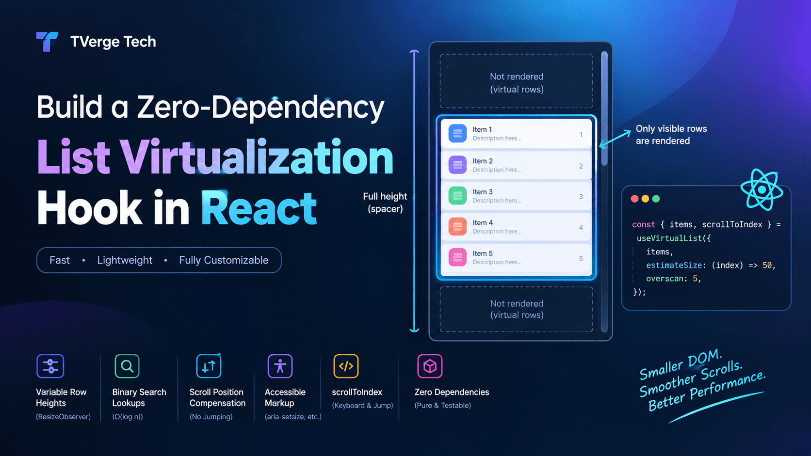
Virtualized lists need to know how tall each row is, but row height depends on content that you cannot predict. Observing each rendered row and updating a measurement cache solves this. We use exactly this approach in our walkthrough, Build a Zero-Dependency List Virtualization Hook in React, where ResizeObserver measures rows and keeps scroll position stable as measurements arrive.
Using ResizeObserver in React
React adds one complication: components mount, update and unmount, so you must connect and disconnect the observer carefully. The pattern is to get the DOM node through a ref and manage the observer inside an effect. The React documentation covers the underlying rules in Manipulating the DOM with refs, useRef, useEffect, and Synchronizing with Effects.
Always clean up. The function returned from the effect calls disconnect(). React runs this cleanup when the component unmounts, as described in Synchronizing with Effects. Without it, observers keep references to detached elements and your callback may call setState on an unmounted component.
Guard for server rendering.ResizeObserver does not exist on the server. Effects only run in the browser, but the typeof check also protects older environments and test runners.
Avoid redundant state updates. Returning the previous state object from the useState updater when values are unchanged stops needless re-renders.
Keep the effect's dependency list honest. If the observed element can change (for example, with a conditional render), track it with a ref callback or state instead of a plain useRef, so the effect re-runs when the node swaps.
Do not copy the observed size into many layers of state. Compute derived values (such as a layout name) during render rather than syncing them with additional effects. React's guide You Might Not Need an Effect explains this in depth.
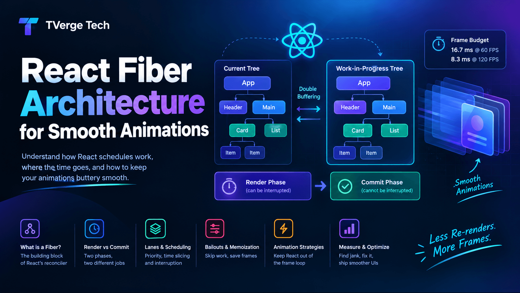
If you are interested in how rendering and commit timing affect this kind of measurement, our article on React Fiber reconciliation and heavy animations explains the render and commit phases that determine when measured sizes can safely be applied. For measurements that must happen before the browser paints, React also offers useLayoutEffect, though a ResizeObserver callback already runs before paint on its own.
The "ResizeObserver Loop" Error Explained
Sooner or later you will see this message in your console or error tracker:
ResizeObserver loop completed with undelivered notifications.
(Older Chrome versions phrased it as "ResizeObserver loop limit exceeded.")
What it means
Delivery works in rounds within a single frame, following the processing model in the Resize Observer specification. After your callback runs, the browser checks whether any observed element has changed size again, possibly because your callback changed something. It continues delivering for elements deeper in the DOM than those already processed. If a change affects an element at the same depth or shallower, the browser defers those notifications to the next frame and reports this error through the window error event.
In most cases it is informational: layout still settles, and nothing is visibly broken. It does, however, create noise in monitoring tools, and it can hint at a real feedback loop.
The classic cause
// Anti-pattern: resizing the element you are observing, based on its own size
const observer = new ResizeObserver(([entry]) => {
  const { inlineSize } = entry.contentBoxSize[0];
  entry.target.style.height = `${inlineSize * 0.5}px`; // changes size again
});
observer.observe(box);
If changing the height can alter the width (for example, a scrollbar appears and narrows the content), the observer can keep triggering itself.
Safer approaches
Move the layout change into CSS. For a fixed aspect ratio, use the aspect-ratio property instead of JavaScript.
Write to a different element than the one you observe, or to an element that cannot influence the observed element's size.
Defer the write by one frame with requestAnimationFrame so it lands outside the delivery loop:
Ignore only this specific error in monitoring, rather than silencing all errors, if you have confirmed that the layout is stable.
Performance Best Practices
ResizeObserver is efficient by design, but how you use it still matters.
Reuse one observer for many elements. A single observer can watch hundreds of elements. Create one and route entries to handlers by target, using a WeakMap so removed elements can be garbage collected:
const handlers = new WeakMap();

const sharedObserver = new ResizeObserver((entries) => {
  for (const entry of entries) {
    handlers.get(entry.target)?.(entry);
  }
});

export function watch(element, handler) {
  handlers.set(element, handler);
  sharedObserver.observe(element);

  return () => {
    handlers.delete(element);
    sharedObserver.unobserve(element);
  };
}
Keep callbacks cheap. The callback runs on the main thread in the middle of rendering. Heavy computation there delays paint. Do the minimum, and schedule expensive work separately. web.dev's Optimize long tasks guide covers strategies for breaking up heavy work.
Be careful with debouncing. Debouncing delays your reaction, which can leave the UI visibly out of step with the layout during a resize. For visual updates, run directly in the callback. Reserve debouncing for expensive, non-visual work such as network requests or analytics.
Batch DOM writes. The callback receives all changed entries together. Read what you need from all entries first, then write, to avoid mixing reads and writes and causing layout thrashing.
Observe only what you need. Observing thousands of elements, or observing and updating React state for every one of them, adds up. Pair large lists with virtualization.
Mind layout shift. Late-arriving size changes can contribute to visual instability. Reserving space with CSS (explicit dimensions or aspect-ratio) is the first defense; see web.dev's guide to Cumulative Layout Shift for how this is measured and reduced.
ResizeObserver vs. CSS Container Queries
Container queries let CSS respond to the size of a parent container, with no JavaScript. They cover the majority of "adapt this component to its space" cases. The MDN guide to container queries explains the syntax and support, and the container-type reference documents how to declare a container.
Run JavaScript logic when size changes (charts, maps, editors)
ResizeObserver
Detect truncated or overflowing text
ResizeObserver
Adjust behavior (not just style) based on size
ResizeObserver
The principle: use CSS when you are changing presentation, and ResizeObserver when you need the number in JavaScript. CSS is declarative, runs in the browser's optimized layout path, and cannot throw loop errors.
Testing Code That Uses ResizeObserver
Test environments built on jsdom do not implement layout, and they often lack ResizeObserver entirely. Your tests will throw ResizeObserver is not defined unless you provide a stand-in. With Vitest you can also use vi.stubGlobal to install it for a single test file.
A minimal mock lets you trigger size changes manually:
// test-setup.ts
class MockResizeObserver {
  static instances: MockResizeObserver[] = [];
  callback: ResizeObserverCallback;
  targets = new Set<Element>();

  constructor(callback: ResizeObserverCallback) {
    this.callback = callback;
    MockResizeObserver.instances.push(this);
  }

  observe(target: Element) {
    this.targets.add(target);
  }
  unobserve(target: Element) {
    this.targets.delete(target);
  }
  disconnect() {
    this.targets.clear();
  }

  // Test helper
  trigger(target: Element, width: number, height: number) {
    const size = [{ inlineSize: width, blockSize: height }];
    this.callback(
      [
        {
          target,
          contentRect: { width, height } as DOMRectReadOnly,
          contentBoxSize: size,
          borderBoxSize: size,
          devicePixelContentBoxSize: size,
        } as unknown as ResizeObserverEntry,
      ],
      this as unknown as ResizeObserver
    );
  }
}

globalThis.ResizeObserver =
  MockResizeObserver as unknown as typeof ResizeObserver;
Call trigger() inside your test, wrapped in React's act() helper if you are testing React components, then assert on the resulting UI. Because jsdom cannot compute real layout, treat these as logic tests and keep a small number of real-browser end-to-end tests for layout-critical behavior.
Accessibility and User Experience Considerations
Size-aware components should still work for everyone:
Do not hide essential content at small sizes. If a toolbar collapses into a menu, keep every action reachable by keyboard and screen readers.
Respect zoom and text scaling. Users who zoom to 200% or increase font size effectively make containers smaller. Size-based logic should handle this gracefully. This relates to the WCAG Reflow success criterion, which asks that content remain usable without two-dimensional scrolling at narrow widths.
Avoid layout jumps while the user is interacting. Changing a layout mid-click or mid-scroll can cause mis-taps and disorientation.
Honor reduced motion. If your size-driven changes include animation, respect the prefers-reduced-motion media query.
Common Mistakes and How to Fix Them
Mistake
Why it hurts
Fix
Forgetting to disconnect() or unobserve()
Memory leaks and updates on removed components
Clean up in the effect's return function
Expecting padding changes to fire the callback
Default box is content-box
Observe with { box: "border-box" }
Modifying the observed element's size in its own callback
Loop errors and jitter
Use CSS, write to another element, or defer a frame
Calling setState with a new object every time
Unnecessary re-renders
Compare with previous values before updating
Using contentRect everywhere
Legacy property, less precise for writing modes
Use contentBoxSize or borderBoxSize
Observing without a feature check in shared or SSR code
Crashes where the API is missing
Guard with typeof ResizeObserver !== "undefined"
Debouncing visual updates
UI lags behind the layout
Update directly, debounce only expensive side effects
Assuming an initial callback for hidden elements
display: none elements have no size
Handle the first callback after the element becomes visible
A Quick Implementation Checklist
Before shipping code that uses ResizeObserver, confirm:
Are you observing the right box (content-box versus border-box)?
Is every observer disconnected when the component or page region goes away?
Does your callback avoid resizing the element it observes?
Are state updates skipped when values have not changed?
Does the feature degrade gracefully if the API is unavailable?
Have you tested at zoomed and narrow sizes, and with web fonts loading late?
Frequently Asked Questions
What is ResizeObserver used for?
ResizeObserver reports when an element's size changes. Common uses include resizing canvases and charts, measuring rows in virtualized lists, detecting truncated text, and running logic that depends on a component's available space.
Is ResizeObserver supported in all browsers?
It has been available in all major browsers since July 2020 and is marked as Baseline widely available on MDN. Specific options, such as device-pixel-content-box, have narrower support, so check the browser compatibility table on the observe() page for the exact feature you use.
What is the difference between ResizeObserver and the window resize event?
The window resize event fires only when the browser viewport changes size. ResizeObserver fires when a specific element changes size for any reason, including content changes, CSS updates and parent layout shifts.
Does ResizeObserver fire on page load?
Yes, in most cases. When you call observe() on an element with a non-zero size, the callback fires once with its initial size. Elements that are hidden with display: none have no size and do not trigger that first callback until they become visible.
How do I fix "ResizeObserver loop completed with undelivered notifications"?
The message means a resize caused further resizes that could not all be delivered in the same frame. Avoid changing the size of the element you are observing from inside its own callback. Prefer CSS for layout rules, write to a different element, or defer the change with requestAnimationFrame. The error is often harmless, but it is worth investigating if you also see visual flicker.
Should I use ResizeObserver or container queries?
Use container queries when you only need to change styles at certain container sizes. Use ResizeObserver when JavaScript needs the actual dimensions or must react in code, such as for canvas rendering, charts, editors and virtualization.
Does ResizeObserver hurt performance?
Used correctly, it is far cheaper than polling or repeatedly reading layout properties, because the browser delivers sizes after it has already computed layout. Problems come from heavy callbacks, observing very large numbers of elements, or triggering state updates on every change.
How do I use ResizeObserver with React?
Attach a ref to the element, create the observer inside useEffect, call observe(), and return a cleanup function that calls disconnect(). Wrapping this in a custom hook such as useElementSize keeps components clean and reusable.
Key Takeaways
ResizeObserver tells you when an element changes size, regardless of the cause, which the window resize event cannot do.
By default it watches the content box. Pass { box: "border-box" } when padding and border matter.
Callbacks run after layout and before paint, making it safe to read size-related properties without forcing extra layout.
In React, create the observer in an effect, guard against missing support, skip redundant state updates, and always disconnect on cleanup.
The loop error usually means a callback is resizing something that feeds back into what is being observed. Move that work to CSS or defer it.
Prefer CSS container queries and aspect-ratio for style-only changes, and keep ResizeObserver for cases where JavaScript genuinely needs the measurement.