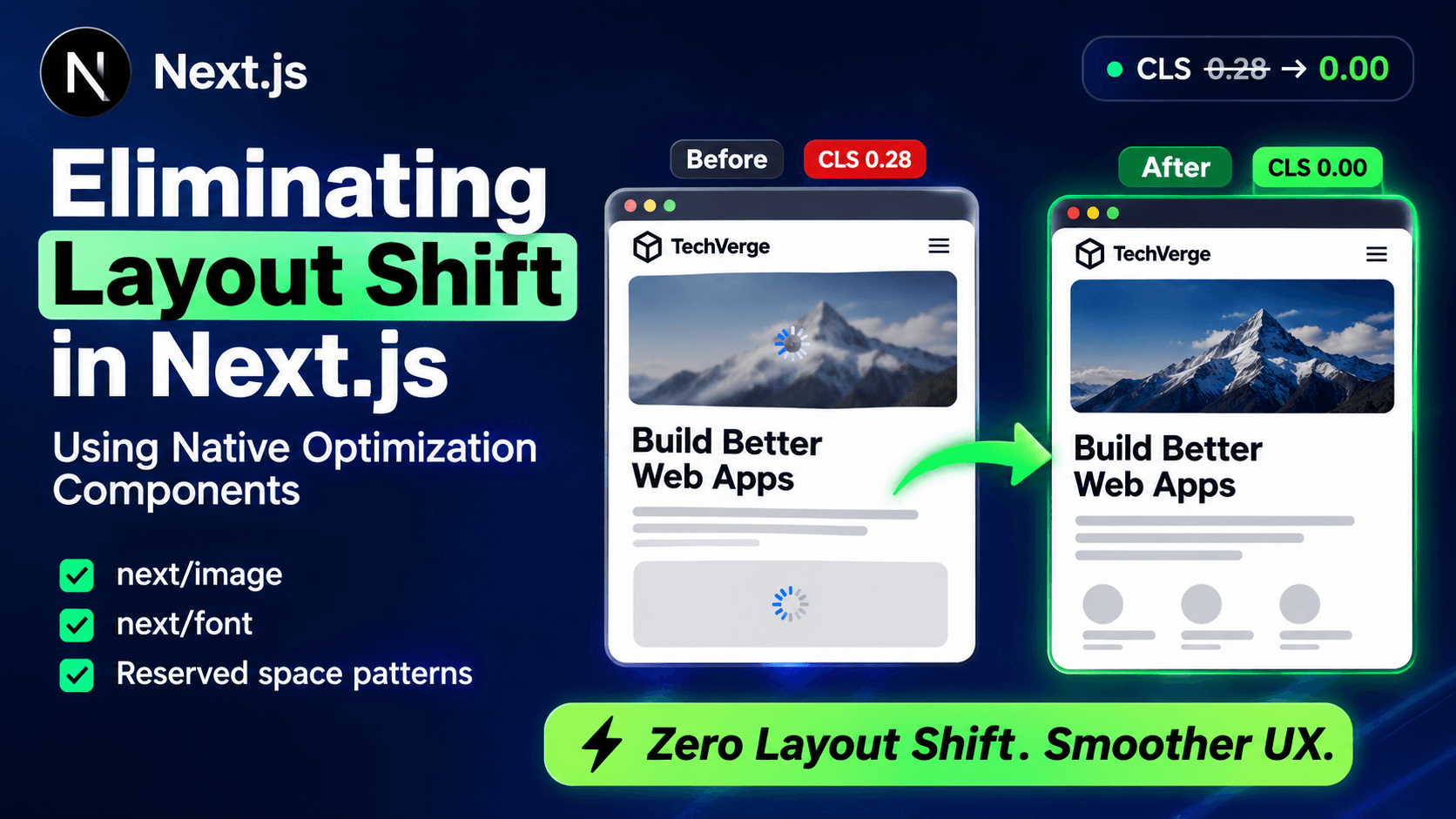
Eliminating Layout Shift in Next.js Using Native Optimization Components
By the end of this walkthrough, you'll have taken a Next.js page with a Cumulative Layout Shift (CLS) score of roughly 0.28 — solidly in Google's "poor" range — down to effectively 0.00, using nothing but next/image, next/font, and two reserved-space patterns for content that loads after the initial render. None of this requires third-party libraries or manual size-adjust math; the non-trivial part is understanding why each shift happens at the browser-rendering level so you fix the actual cause instead of masking the symptom with a loading spinner.
Prerequisites
- Next.js 15.x or later (App Router) — the font and image APIs referenced here are stable in both 14 and 15; consult the official upgrade guide if you're on 13: https://nextjs.org/docs/app/guides/upgrading/version-15
- Node.js 18.18 or later
- A Chromium-based browser with DevTools for Performance/Lighthouse measurements
- Basic familiarity with the App Router file structure (
app/layout.tsx,app/page.tsx) - No account or API keys required for this tutorial
Step 1: Reproduce the Baseline CLS Problem
Before fixing anything, measure what's actually broken. Consider a typical marketing page: a hero image loaded with a raw <img> tag, a custom Google Font loaded via a <link> tag in the <head>, and a testimonials carousel that fetches data client-side after mount.
jsx
// app/page.tsx — BEFORE (unoptimized)
export default function Home() {
  return (
    <main>
      <img src="/hero.jpg" alt="Product hero" />
      <h1 style={{ fontFamily: 'Poppins, sans-serif' }}>Ship faster</h1>
      <TestimonialsCarousel />
    </main>
  );
}
Run Lighthouse against this page (Chrome DevTools → Lighthouse → Performance, mobile throttling on). You'll typically see three separate shift events: one when the hero image finishes downloading and the browser learns its true dimensions, one when Poppins replaces the fallback system font and every line of text reflows, and one when the carousel's fetched data mounts and pushes the footer down.
Expected output: A Lighthouse CLS score in the 0.2–0.3 range, with the report's "Avoid large layout shifts" audit listing the <img>, the heading text node, and the carousel container as the three culprits.
Step 2: Eliminate Image-Driven Shift with next/image
The root cause of the hero image shift is that a raw <img> tag has no intrinsic size until the browser downloads enough of the file to read its header — the layout engine allocates zero height for it in the meantime, then jumps once the real dimensions arrive. next/image fixes this by requiring width and height (or a fixed-size parent) up front, so the layout engine reserves the correct space before a single byte of image data has loaded. Full API details, including the complete list of supported props, are in the official reference: https://nextjs.org/docs/app/api-reference/components/image
bash
# No install needed — next/image ships with Next.js core
Replace the raw tag with the component, supplying the image's real pixel dimensions:
jsx
// app/page.tsx — AFTER (Step 2)
import Image from 'next/image';
import heroImage from '../public/hero.jpg';

export default function Home() {
  return (
    <main>
      <Image
        src={heroImage}
        alt="Product hero"
        priority
        sizes="(max-width: 768px) 100vw, 1200px"
      />
    </main>
  );
}
Two details matter here beyond just swapping the tag. Importing heroImage as a static asset (rather than passing a string path) lets Next.js read the file's dimensions at build time and inject them automatically, so you don't have to hardcode width/height and risk them drifting out of sync with the actual file. Second, priority disables lazy-loading and adds a <link rel="preload"> for this specific image — appropriate here because it's above the fold; for below-the-fold images, omit priority and let the default lazy-loading behavior apply, since eagerly loading everything would hurt Largest Contentful Paint (LCP) instead of CLS.
If you're pulling the image from a remote URL rather than a local file, you must supply width and height explicitly, because Next.js can't inspect a build-time asset that doesn't exist locally:
jsx
<Image
  src="https://cdn.example.com/hero.jpg"
  alt="Product hero"
  width={1200}
  height={630}
  priority
/>
Checkpoint: Reload the page and re-run Lighthouse. The <img>-related shift entry should disappear entirely from the "Avoid large layout shifts" audit — next/image renders a placeholder box at the exact aspect ratio before the file finishes downloading, so there is no dimension change to trigger a reflow.
Step 3: Eliminate Font-Swap Shift with next/font
The heading shift happens because the browser initially paints <h1> in a fallback font (whatever your CSS font-family stack falls back to, typically a system font), then swaps to Poppins once the <link>-loaded stylesheet and font file finish downloading. Since Poppins and your fallback font almost certainly have different character widths and line heights, that swap changes how much horizontal and vertical space the text occupies — every element below the heading shifts.
next/font solves this differently than you might expect: it doesn't just self-host and preload the font (though it does that too, eliminating the round-trip to Google's servers). Its core CLS fix is that it inspects the actual font file's metrics at build time and generates a size-adjust CSS descriptor for the fallback font, so the fallback is forced to occupy the same width and line-height as Poppins before Poppins has even loaded. When the swap happens, there's no dimension delta left to cause a shift. The full font module reference, including all loader options, is documented officially here: https://nextjs.org/docs/app/getting-started/fonts
Remove the manual <link> tag and the inline fontFamily style, then load the font through the module:
jsx
// app/fonts.ts
import { Poppins } from 'next/font/google';

export const poppins = Poppins({
  subsets: ['latin'],
  weight: ['400', '600'],
  display: 'swap',
});
jsx
// app/layout.tsx
import { poppins } from './fonts';

export default function RootLayout({ children }: { children: React.ReactNode }) {
  return (
    <html lang="en" className={poppins.className}>
      <body>{children}</body>
    </html>
  );
}
Applying the font at the root layout, rather than per-component, means the size-adjust fallback is calculated once and inherited everywhere Poppins is used — avoiding duplicate font instances that would otherwise bloat your CSS bundle if you called Poppins() separately in multiple files.
If you're loading a self-hosted or custom font file instead of a Google Font, the API is nearly identical, just pointed at a local file:
jsx
// app/fonts.ts — custom font variant
import localFont from 'next/font/local';

export const brandFont = localFont({
  src: '../public/fonts/BrandSans-Variable.woff2',
  variable: '--font-brand',
  fallback: ['Arial'],
});
Checkpoint: Re-run Lighthouse a second time. The heading's shift entry should be gone. If you inspect the generated CSS in DevTools, you'll see a @font-face block for a fallback font with a size-adjust percentage value close to (but not exactly) 100% — that adjustment is what's absorbing the metric difference between the fallback and Poppins.
Step 4: Reserve Space for Client-Fetched Content
The carousel shift is a different category of problem — next/image and next/font can't fix it, because it isn't about image or font loading at all. It happens because TestimonialsCarousel renders nothing (or a zero-height container) until its useEffect fetch resolves, at which point real content appears and pushes the footer down. The fix is architectural: reserve the final height before the data arrives, either by fetching server-side or by sizing the loading state to match the eventual content.
Server Component fetch vs. client-side fetch: Fetching in a Server Component means the data — and therefore the correct final height — is present in the very first HTML the browser receives, so there's nothing to shift once the page hydrates. Client-side fetching only makes sense when the content is genuinely user-specific or needs to update without a full page reload; that convenience costs you a shift unless you explicitly reserve the space. See the official data-fetching reference for the full set of caching and revalidation options used in the snippet below: https://nextjs.org/docs/app/api-reference/functions/fetch
If the carousel data doesn't depend on request-time user state, move the fetch server-side:
jsx
// app/components/TestimonialsCarousel.tsx
async function getTestimonials() {
  const res = await fetch('https://api.example.com/testimonials', {
    next: { revalidate: 3600 },
  });
  return res.json();
}

export default async function TestimonialsCarousel() {
  const testimonials = await getTestimonials();
  return (
    <section aria-label="Testimonials">
      {testimonials.map((t: { id: string; quote: string }) => (
        <blockquote key={t.id}>{t.quote}</blockquote>
      ))}
    </section>
  );
}
If the fetch genuinely must stay client-side, reserve the container's height explicitly so it doesn't collapse to zero while loading:
jsx
// app/components/TestimonialsCarousel.tsx — client-fetch variant
'use client';
import { useEffect, useState } from 'react';

export default function TestimonialsCarousel() {
  const [testimonials, setTestimonials] = useState<null | { id: string; quote: string }[]>(null);

  useEffect(() => {
    fetch('/api/testimonials')
      .then((res) => res.json())
      .then(setTestimonials);
  }, []);

  return (
    <section aria-label="Testimonials" style={{ minHeight: '280px' }}>
      {testimonials
        ? testimonials.map((t) => <blockquote key={t.id}>{t.quote}</blockquote>)
        : <div aria-hidden="true" style={{ height: '280px' }} />}
    </section>
  );
}
The minHeight: '280px' value isn't arbitrary — measure your actual rendered carousel's height in DevTools and use that number, or the reserved space will either be too short (partial shift remains) or too tall (wasted whitespace before content loads).
Checkpoint: Run Lighthouse a third time. All three shift entries should be gone, and the overall CLS score should read 0.00 or a negligible value below 0.01 (some residual sub-pixel rounding is normal and not worth chasing further).
Common Errors
Layout shift persists after adding next/image despite correct width/height. This usually means the image's container has no defined aspect ratio in your CSS — if a parent div uses display: flex without constraints, the image can still resize unpredictably when the viewport changes. Set sizes accurately to match your actual responsive breakpoints, and verify the parent isn't overriding the component's computed aspect ratio.
next/font shift still shows up on the very first paint only. This is typically not next/font failing — it's a separate <link rel="stylesheet"> or @import for the same font elsewhere in the codebase (a leftover from before migrating to next/font) still firing a network request. Search the codebase for any remaining Google Fonts <link> tags and remove them; having two loading paths for the same font can reintroduce the exact shift you just fixed.
CLS score is fixed in Lighthouse but real-user monitoring (via web-vitals or your analytics provider) still shows shifts. Lighthouse measures a single synthetic run under fixed network conditions. Real users on slower connections may experience the fallback-to-custom-font swap over a longer window, during which a user interaction (like scrolling) can interact with the shift differently than a static audit does. Check whether Core Web Vitals field data in Google Search Console shows a persistent pattern before assuming the fix is incomplete — occasional field-data noise is expected. Official definitions for CLS and the other Core Web Vitals metrics are here: https://web.dev/articles/cls
What This Doesn't Cover
next/image and next/font address layout shift caused by images and web fonts specifically — they will not fix shifts caused by injected ads, cookie-consent banners, or A/B testing scripts that mutate the DOM after initial render. Those require the same reserved-space principle applied manually (fixed-height containers, or server-side determination of which variant to render) since there's no equivalent built-in Next.js component for third-party script-driven layout changes. If your app relies heavily on next/script for analytics or ad tags, that's a separate optimization pass — the official script-loading strategies reference covers the loading priorities available: https://nextjs.org/docs/app/api-reference/components/script